The Client
ICAN Hard Seltzer is a brand from the award-winning winery Mercer Estates. A family-owned company headquartered in Prosser, WA focused on making their mark in an emerging industry they have developed a wine-based hard seltzer beverage.
Connecting to the Brand Story
All of the details are incorporated into creating the perfect label design and product packaging matter. From strategy to promotion discover the details we highlight in the ICAN Hard Seltzer creation process.
Package Design
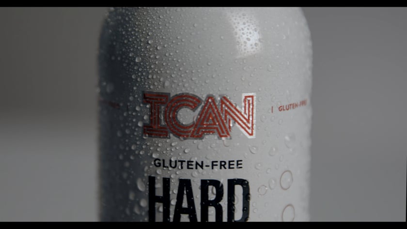
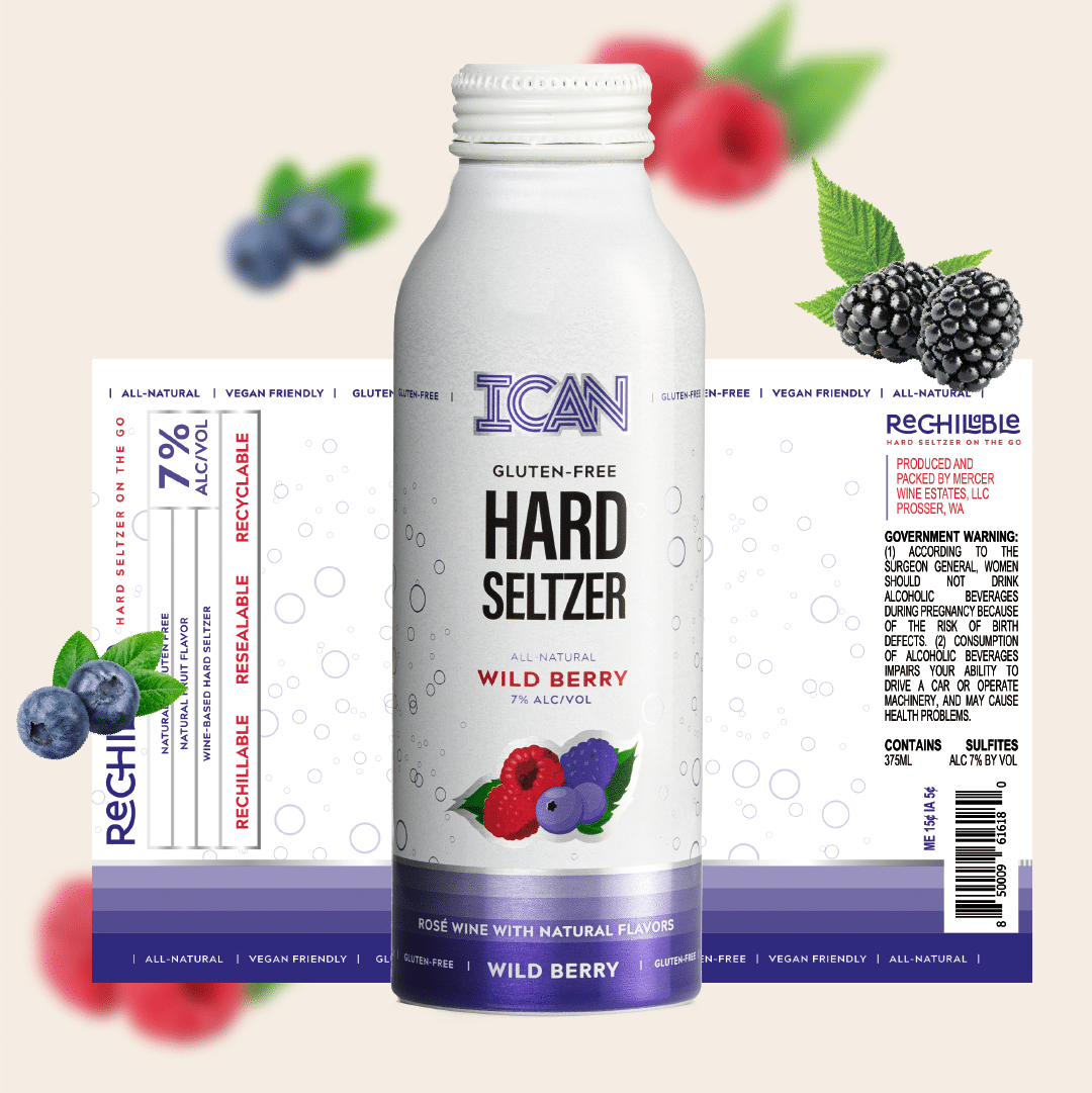
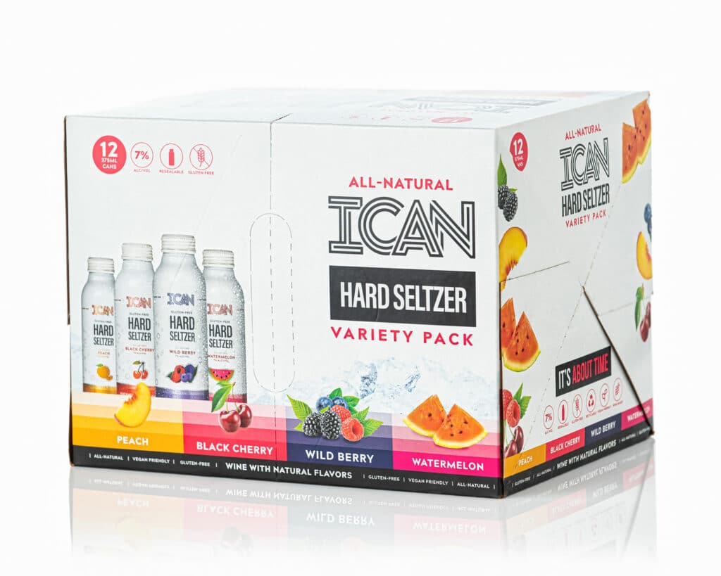
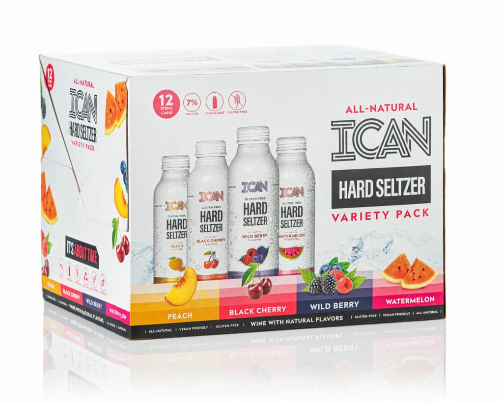
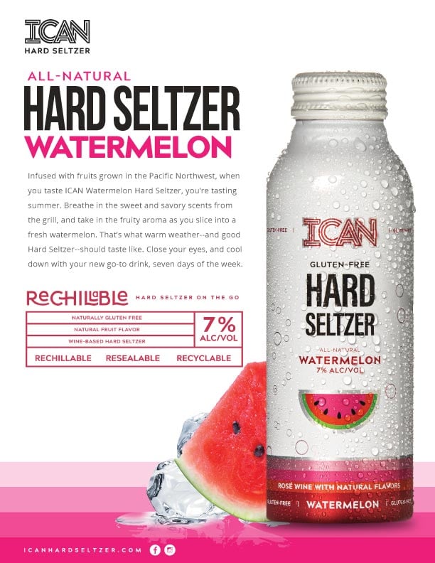
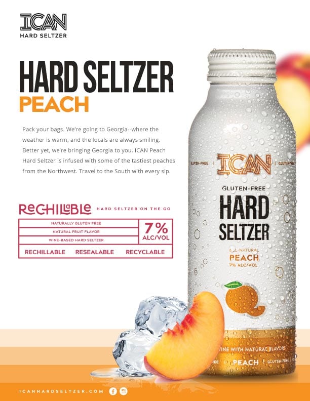
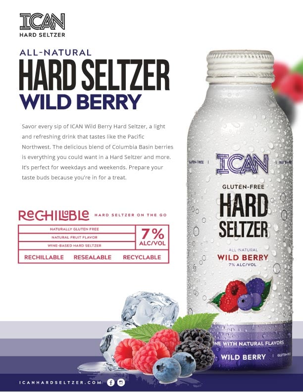
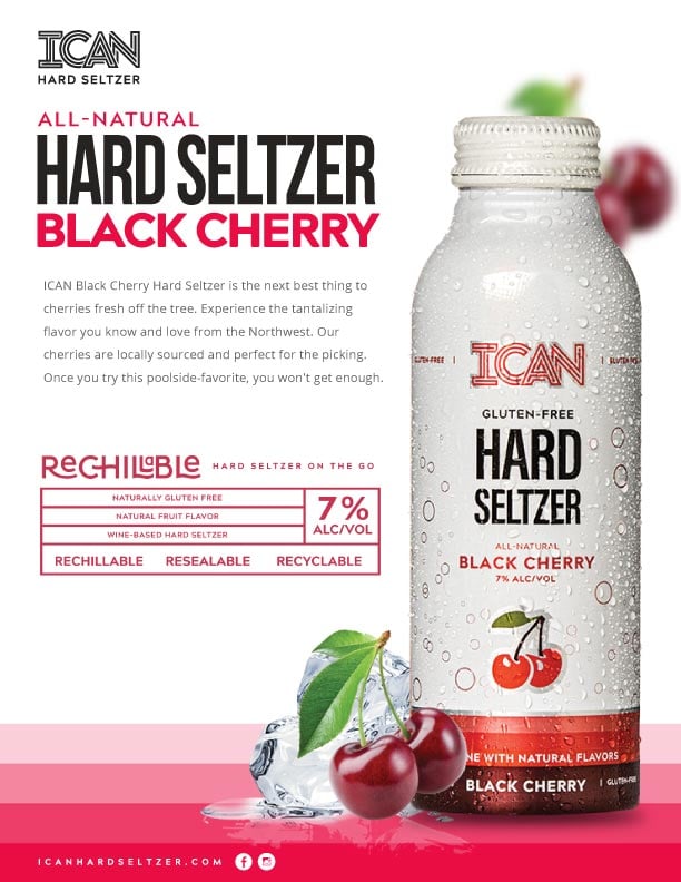
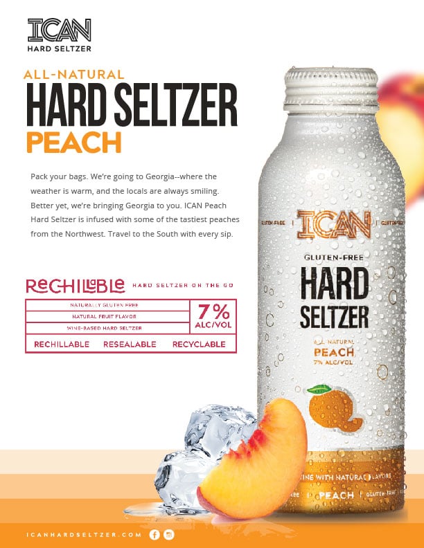
ICAN Hard Seltzer was the first in the wine-based seltzer category to have a twist-top and that’s how it stood apart from competitors. Three new callouts were made – rechillable, resealable, and recyclable. Now we are not only showing the consumer what makes this can design different, we are telling them.
All of these elements are prominently featured on the final can design. Knowing this can would sit directly next to competitors on the shelf, it was crucial to evaluate how the ICAN design would stack up.
Label Design & Cap Creation
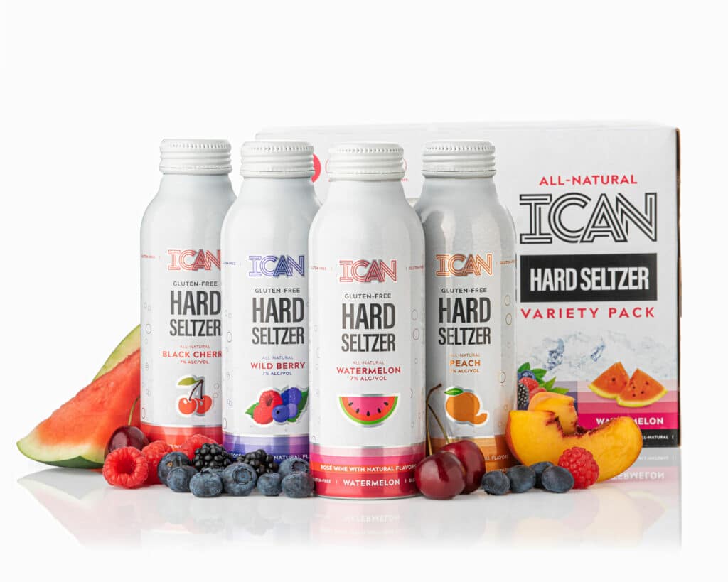
Creating a can design that bursts with flavor! This can is a standout on its own for having a resealable top, the first of its kind in the wine-seltzer world.
Our design focused on exciting and educating the consumer on how this wine-based seltzer is bursting with natural flavors all while letting that resealable top shine. We started from the bottom, anchoring the design with a bold blocked gradient, leading to our custom illustrated fruits, below the flavor. We let the pops of color do the talking, communicating to the consumer easily which flavor is which.
Marketing Material
Once flavors, labels, and designs became finalized we moved into designing marketing materials. We promoted the new ICAN Hard Seltzers through sales flyers, presentations, in-store displays, and marketing collateral for the pre-sale market.
Website Design & Development Goals
For the website design we took inspiration from the pre-existing ICAN Wines site focused on incorporating callouts from our package design. Just as we had leaned on the loud pops of color on the package design, we leaned on the packaging for the website. Using muted grays and light blues as the base for the site allowed for the grab-n-go product to do the talking.

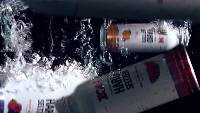
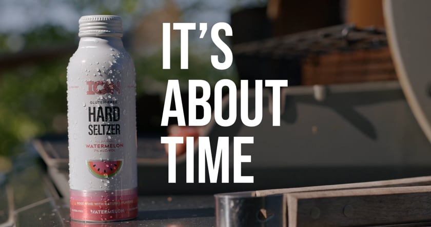
Video Production
We created three videos to roll out the product to market. Our initial video is an introduction to products with beauty shots teasing the flavors, alcohol content, and ingredients to increase brand recognition. Our next video was focused on educating consumers on the natural flavors and beverage itself. And finally we kicked off a seasonal summer campaign emphasizing how the design and reseal-ability of ICAN makes it the perfect summer activity beverage.